First Impressions - Daniel Smith Extra Fine Gouache
As an art supply nerd, you can imagine how stoked I was when I discovered that Daniel Smith was releasing a line of gouache. If you don’t keep your finger on the pulse of water media trends, Daniel Smith is like the Air Jordans of watercolor. There are plenty of great professional brands, but Daniel Smith is ubiquitous in the watercolor world. It’s the bougie shit. So for the New Year and as a reward for reaching a certain goal I won’t yet disclose, I decided to pick some up. This will be a first impressions review. I am not sponsored in anyway, I don’t even have affiliate links because I am lazy. I'm just an art supply enthusiast with no one to talk about pigment colors except the internet void.
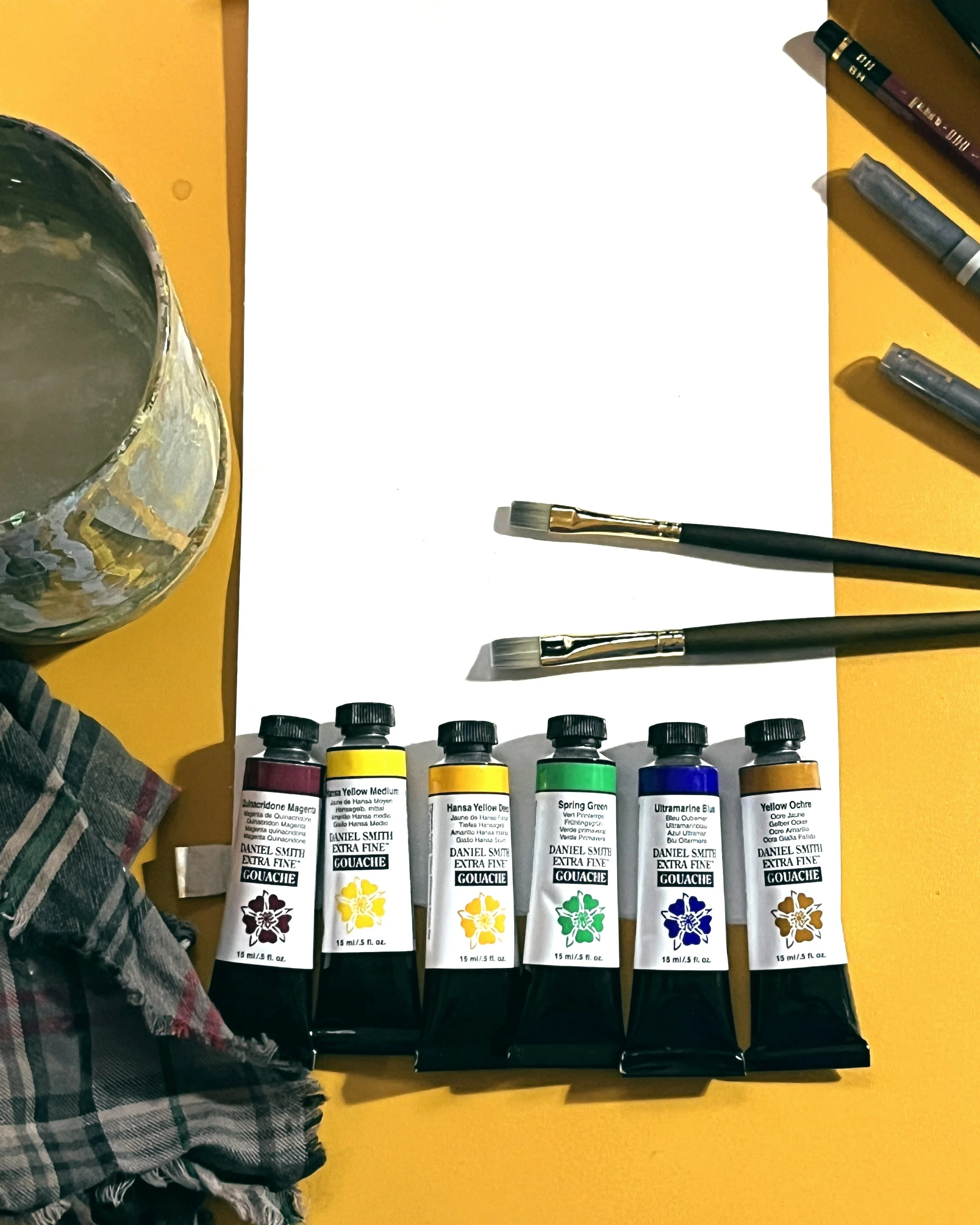
My art store doesn't have the full 74 color line yet, though the inside scoop from my art store bro says they will in the future. I grabbed a few of my usual colors. Typically I like Primary Yellow or Cadmium Yellow. The closest in the DS line at my store is Hansa Yellow: I picked up Hansa Yellow Medium and Hansa Yellow Deep. I was a little disappointed in the selection of greens, I’m always hoping for something comparable to Windsor and Newton’s Linden Green, but I settled for Spring Green. And of course, I got Quinacridone Magenta, Ultramarine Blue, and Yellow Ochre. I’ll list the pigment info for the nerds, otherwise skip ahead.
INSERT PIGMENT STUFF

Daniel Smith claims that their Extra Fine TM Gouache has “Exceptional lightfastness and pure, natural opacity”, meaning there are no opacifiers. Out of the tube, the paints are very creamy. In my experience, Windsor Newton paint sometimes come out of the tube with a consistency of tomato paste or a wet turd. These paints are more usable straight from the tube.
While swatching, I was immediately impressed with the opacity of the yellows. Hansa Yellow Medium is on the warmer side of Lemon yellow, a bit more mustard, but still very pretty.
The Magenta, Ultramarine, and Yellow Ochre are similar to others that I’ve used. The Magenta and Ochre came out a bit separated from the medium, which I’ve noticed happening from other brands, especially with Ochre. Mildly annoying, not a big deal, but resulted in my swatches being a bit patchy.
The Spring Green I didn’t use too much of. This convenience color is comprised of a whopping 3 pigments, but it still mixed with Ultramarine pretty nicely for the small application I needed.

I can’t find the same quote on the website, but the display at my art store claimed that these paints “rewet beautifully” (or something like that) and so far I think that’s true! They seem to reactivate quite easily on the palette. This could be a drawback on paper when trying to do lots of layers. While painting the flowers Wallace is carrying, I felt them getting muddier. But I was also impatient and quick with it, and didn’t spend much time waiting for them to dry.
What about actually painting? Well, this was only a small painting on fairly thin paper, so I only have a small impression. But the yellows on Wallace blended beautifully. However, it seemed like the painting wouldn’t take colored pencils as well as usual. That could have to do with the paper I was using. Only time will tell.
Overall, I am impressed with the texture, opacity, and reactivity of these Daniel Smith paints. I haven’t watched or read any other reviews, and I’ve only done a small painting with them so the only judgment I can pass is that I am looking forward to using them more in the future. Hopefully, I don’t love them too much because they are $12 a tube.

Bonus: I really like Princeton’s Umbria line for Gouache. The stores I went to in Texas didn’t have them, so I am overflowing with lots of other brands, but I hope to accumulate more as my old brushes wear out. I bought two small flatbrushes for this occasion. They’re a bit stiffer than the Heritage line (which I find softer than I’d like for Gouache), but softer than the acrylic brushes (which can be too scratchy for gouache).